Header Component
General Information
- Header figures are generated through a svelte
HeaderFigurecomponent, which can be imported by including the following line in the file's script tag:
import HeaderFigure from '$lib/components/HeaderFigure.svelte'; - The header figures of several pages have common components and layouts, and as such, a component has been created that attempts to render said figures in a consistent and structured manner. Internally, the configuration of the figure is defined through nested objects that specify every detail of the element.
- Four presets have been made for the component, each of them named after the page they are
used on, namely
home,it,over-onsandmultimedia. The overall layout an styling of these presets are preconfigured for ease of use. Alternatively, a custom configuration can be passed on to the component. The meaning of each property contained in these objects will be dicussed in a separate section. - The
HeaderFigurecomponent has a single parameter through which the figure can be configured.config: The configuration of the figure, which is either an object specifying the figure's specifics or a string containing the name of one of the presets listed above.
- The
HeaderFigurecomponent has strict requirements upon the number of columns it spans in its parent's grid—the figure needs a constant width of 16 columns, which are assumed to bevar(--half-block)sized. On top of that, the component needs to span 32 columns in the mobile layout.
Examples
The four available header figures are listed below.
Home
“Autisme is voor mij
geen beperking,
maar een kracht”
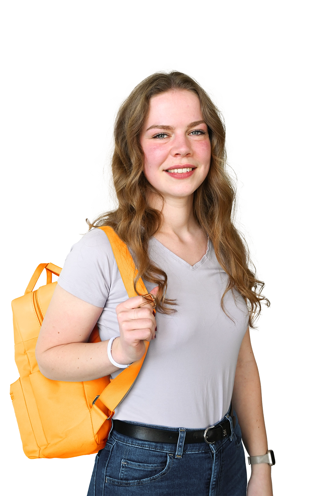
<HeaderFigure config={"home"} />IT
+500
Geslaagde
projecten

<HeaderFigure config={"it"} />Over Ons

<HeaderFigure config={"over-ons"} />Multimedia
+500
Gemaakte
designs
<HeaderFigure config={"multimedia"} />Custom Configuration
The sub-components of the header figure can be configured at a high level of detail. The
default values within the configuration correspond to those used by the home preset. The options are as follows:
- The overarching configuration of the figure can be specified using the following interface.
As such, this should be the top-level object that is passed on to the component in the
configparameter.interface HeaderFigureConfiguration {The options are specified as follows:
includeBrain: boolean;
backgroundColor?: string;
string?: StringConfiguration;
bubble?: BubbleConfiguration;
image: ImageConfiguration;
decal?: "it" | "multimedia";
}includeBrain: A boolean that signifies whether the figure should have the brain symbol.backgroundColor: An optional background color for the figure.string: An optional configuration for the string decal used in the figure's background.bubble: An optional configuration for the figure's text bubble.image: A mandatory configuration for the figure's image.decal: An optional name of the icon to be included (eitheritormultimedia).
- The figure's image can be configured through the following interface.
interface ImageConfiguration {The options are specified as follows:
path: string;
alt: string;
container?: {
left?: string;
top?: string;
right?: string;
bottom?: string;
};
left?: string;
top?: string;
width?: string;
mask?: boolean;
}path: The path that is to be used as the image's source.alt: An alternative text to be shown if the image cannot be loaded.container: An optional list of offsets to be applied to the borders of the image's container.left: An optional css-value specifying the spacing to be applied to the left of the image.top: An optional css-value specifying the spacing to be applied to the top of the image.width: An optional css-value specifying the width of the image.mask: An optional boolean flag that specifies whether the image requires a mask to cover the rounded corner in the bottom left corner.
- The text bubble used within the figure can be specified as follows.
interface BubbleConfiguration {The options are specified as follows:
snippet: Snippet;
backgroundColor?: string;
color?: string;
width?: string;
height?: string;
left?: string;
top?: string;
zIndex?: number;
}snippet: A snippet that renders the contents of the figure's chat bubble.backgroundColor: An optional css-value that contains the desired background color.color: An optional css-value that specifies the text color to be used within the bubble.width: An optional css-value that provides the width of the text bubble.height: An optional css-value that provides the height of the text bubble.left: An optional css-value that defines the distance between the left side of the text bubble and the encompassing figure.top: An optional css-value that defines the distance between the top edge of the text bubble and the encompassing figure.zIndex: An optional z-index for the figure's text bubble.
- Lastly, an interface is provided through which the background string decoration can be
configured.
interface StringConfiguration {The options are specified as follows:
respectCutout: boolean;
isLightblue: boolean;
left?: string;
top?: string;
backgroundSize?: string;
transform?: string;
mask?: boolean;
}respectCutout: Whether the decal string is allowed to go outside of the background's cutouts.isLightblue: A boolean that tells that the background should be lightblue instead of darkblue.left: An optional css-value that defines theleftcss property to be used to place the string.top: An optional css-value that defines thetopcss property to be used to place the string.backgroundSize: An optional css-value holding amask-size/background-sizecss property value to be applied to the string background decal.transform: An optional css-value taht contains the transform to be applied to the decal.mask: Whether to include a mask in the bottom-left corner that hides the part of the string located under the figure's image.